Ok. The truth is that when I go off to my tiny corner of the study to get inky I always disappear with the words "I'll only be about half an hour" - then, about three hours later David appears letting me know that my half an hour was yet again lost in the midst of time! So I knew that I needed a clock and seeing the wonderful Wendy Vecchi's gi-normous Pocket Watch I knew that was my starting point! My first attempt was fab fun as I sprayed it in many different
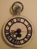
Creative Expressions Cosmic Shimmer misters - layering up the colours until it looked grungy and very cool! The Grungeboard clock face was cut using Tim's Weathered Clock die and my trusty Vagabond. It was covered in black Paint Dabber and, when dry, sanded down and Vintage Photo Distress Ink and gold Paint Dabber added . I used some of Tim's Sprockets and a real clock mechanism. The hands were a little too bright so I used Ginger and Red Pepper Alcohol Inks to de-bling them! I was really pleased with my
clock but the rest of the family said they couldn't read the time (and they might have been right...) So, in keeping with Hel's Sunday Stamper challenge to use white I used the same technique as I did here with Picket Fence Crackle Paint and clear UTEE but rubbed a bit of Vintage Photo into the cracks in between the two sessions of embossing. I made sure that the Crackle Paint wasn't too perfect as I wanted it to be a little more uneven and grungy than when I last
used the technique. In Jet Black Archival Ink I stamped swirls onto the 'winder', then I reassembled the clock as it was did before! I want to see how it looks for a while - but I might add wings to it (then time really might fly!) but it needs to settle into it's new home first!
Hopefully everyone can read the time clearly now and I hope time flies when you are being creative - because surely that's a sign that you're enjoying it?!!! Gabrielle x
ps - the photos make the clock look creamy - this might have a lot to do with the lack of natural light today due to the relentless rain experienced in Milton Keynes! It might be good for gardens but it plays havoc with photos!
 |
| My first attempt! |
clock but the rest of the family said they couldn't read the time (and they might have been right...) So, in keeping with Hel's Sunday Stamper challenge to use white I used the same technique as I did here with Picket Fence Crackle Paint and clear UTEE but rubbed a bit of Vintage Photo into the cracks in between the two sessions of embossing. I made sure that the Crackle Paint wasn't too perfect as I wanted it to be a little more uneven and grungy than when I last
used the technique. In Jet Black Archival Ink I stamped swirls onto the 'winder', then I reassembled the clock as it was did before! I want to see how it looks for a while - but I might add wings to it (then time really might fly!) but it needs to settle into it's new home first!
Hopefully everyone can read the time clearly now and I hope time flies when you are being creative - because surely that's a sign that you're enjoying it?!!! Gabrielle x
ps - the photos make the clock look creamy - this might have a lot to do with the lack of natural light today due to the relentless rain experienced in Milton Keynes! It might be good for gardens but it plays havoc with photos!


Comments
Kazx
xxx Hazel.